Google Chrome is the most popular web browser, taking almost two-thirds of the market at the end of 2023.

This gives Google access to heaps of data about our experiences on the web and how different websites perform across devices, locations, and connections. What’s more, Google makes much of this data publicly available, for free, through its Chrome UX Report.
So, if you want to see how your site compares to others in user experience, this report is an indispensable resource that any website owner and marketer should at least know how to use.

As someone who’s used Chrome’s data quite a bit to better understand the HubSpot blog’s performance, I’ll explain what exactly this report is, how to access and view the data, and finally walk through a demo of its most accessible feature, the dashboard.
Table of Contents
- What is the Chrome UX Report?
- What makes a site eligible for the Chrome UX Report?
- How to Access the Chrome UX Report
- Demoing the CrUX Dashboard
What is the Chrome UX Report?
The Chrome UX report, usually shortened to CrUX, is a public dataset created by Google containing real user experience data from across the web
CrUX compiles data from Google Chrome browsers on desktops and mobile devices around the world, and compiles this data into Core Web Vitals — metrics created by Google to quantify the user experience and performance of a web page.
More specifically, these metrics are Largest Contentful Paint (LCP), First Input Delay (FID), and Cumulative Layout Shift (CLS). Core Web Vitals factor into Google’s ranking algorithms and determine how pages appear in search results, so you’re going to want to pay attention to them.
CrUX also contains meta-information about users’ browsing conditions, including device type and connections, which allows you to parse CrUX data by these conditions to better understand segments of your audience.
Covering over 18 million websites as of 2024, the scope of CrUX is incredible, as are its benefits to website owners, digital marketers, developers, and anyone else trying to make their website the best it can be. CrUX lets you see how your site stacks up against the rest and gives you actionable data you can use when designing and improving your site’s user experience.
What makes a site eligible for the Chrome UX Report?
The Chrome UX Report pulls data from two types of sources: individual webpages and entire websites, which Google calls “origins.” For either a page or an origin to be made available in CrUX, it must meet two requirements:
- The page or origin must be public. Google should be allowed to index it so that users can find it through Google search.
- The page or origin must be what Google calls “sufficiently popular,” meaning the page/origin must receive a minimum amount of traffic. This ensures a large enough sample size to grade an origin/page.
Google does not share the minimum traffic required for a page or origin to be considered “sufficiently popular.” However, you can easily check whether your web page meets these criteria by plugging the page URL into PageSpeed Insights.
If you see results for your site, it’s publicly discoverable (which, unless you choose to block Google from indexing it, is likely true) and popular enough to be included in the CrUX dataset.
.png)
Free UX Research Kit + Templates
3 templates for conducting user tests, summarizing your UX research, and presenting your findings.
- User Testing Template
- UX Research Testing Report Template
- UX Research Presentation Template
How to Access the Chrome UX Report
CrUX is, at its core, a dataset. And a big one at that. There are several ways you can view the data and get insights from it. I’ll cover those methods in this section, ranging from least to most technical.
PageSpeed Insights
Google’s PageSpeed Insights tool is the simplest way to access data from CrUX. It’s a free tool that presents the latest performance data for any site in CrUX, segmented by phone and desktop users.
To use PageSpeed Insights, just paste in the URL of the page you want to analyze. You’ll be given a report of Core Web Vitals for the page, broken down by mobile and desktop performance.
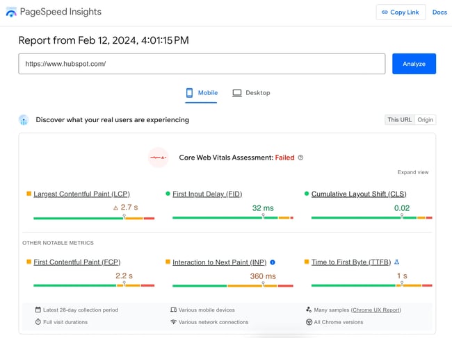
It also provides scores from 0 to 100 in four areas — performance (i.e., speed), accessibility, best practices, and SEO — and provides recommendations to improve these areas.
If you want quick, actionable feedback on your site or a competitor’s, use this tool. For a more thorough look into the CrUX dataset without too much extra work, read on.
The CrUX Dashboard in Looker Studio
The next method of accessing CrUX data is by viewing it through the CrUX Dashboard, a free dashboard in Looker Studio that provides a visualization of CrUX data that you can filter and parse for insights.
If you’re a site owner with little to no experience with data analysis, the CrUX Dashboard is an excellent tool. In my opinion, it’s the best way to view data if you want to achieve more fine-grained insights about your website without knowledge of APIs or SQL.
To use the CrUX Dashboard, enter an origin URL into the text field on this page (it will only accept an origin URL, not a page URL). A new looker dashboard will be generated and can be shared with teammates.
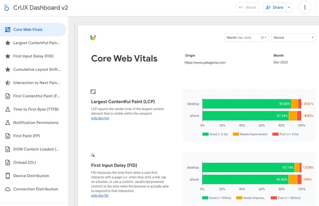
The dashboard contains an overview of Google Core Web Vitals, as well as other metrics to gauge performance. Each metric is broken down into the buckets “good,” “needs improvement,” and “poor.” Plus, there are breakdowns by mobile/desktop and connection type.
The data in the CrUX dashboard updates automatically. To edit the dashboard, you can make your own copy — just note that the months need to be updated manually (or, create a custom dashboard every month and make a new copy).
If you want an even more detailed picture of distributions of these core metrics beyond the buckets that the dashboard provides, or to zoom in on global regions, use SQL queries or query the API.
Still, even if you’ve never used Looker before, the report is still pretty intuitive. Later on, we’ll take a closer look at an example of the CrUX Dashboard in action.
Exploring CrUX Via SQL Queries
It’s also possible to access the CrUX data by querying its database, Google’s BigQuery, with SQL commands.
With this method, you can access data as far back as 2017 and achieve more granular insights than what you’d be able to get using PageSpeed Insights or a CrUX Looker dashboard.
In essence, the CrUX Dashboard is just a visualization of the queries it’s making from BigQuery — it’s just doing the work for you so you don’t need to worry about using SQL. But, if you want to access lower-level data for custom reports, this is your best bet.
To query the CrUX dataset with SQL, you’ll need to create a Google Cloud project if you haven’t already. See Google’s guide to getting started with CrUX querying for how to set up a Google Cloud project and tips to start querying with SQL.
Unlike PageSpeed Insights and the CrUX Dashboard, this method isn’t completely free. However, there is a free plan on which you can store up to 10 GiB (a little over 10 gigabytes) and process up to one TiB (a little over one terabyte) per month. If you’re not processing massive amounts of data, the free plan should sustain you. There’s also a free trial offer for your first 90 days, which gives you $300 in credit toward queries and storage.
The CrUX API
Finally, the CrUX API is a free REST API for accessing the CrUX dataset, and it’s also the most technically demanding.
The CrUX API aggregates data from the past 28 days to provide its outputs and updates daily. It allows access to data in the report at the page level and origin-level. See Google’s documentation for info on how to get an API key and query the APIs.
Google actually currently provides two APIs for querying the CrUX database: The CrUX API and the CrUX history API. The main difference between the two is that the CrUX History API allows you to access historical trends in user experience over the past six months, and is updated weekly. The CrUX API only allows access to data within the past 28 days.
Demoing the CrUX Dashboard
If you’re looking to get a high-level overview of how your website overall, as well as individual pages, are performing over time, without having to delve into SQL or API queries, or custom dashboards, the CrUX Dashboard in Looker is probably your best option.
In this section, I’ll walk through how to analyze a website using the CrUX Dashboard.
All CrUX data is public, so you can analyze any website with this method. For the purposes of the demonstration, I’ll be using https://www.hubspot.com/ as the origin URL for the analysis in this section.
To create my custom dashboard, I’ll start by going to this page and pasting in the URL https://www.hubspot.com/. A CrUX Dashboard is automatically generated for me.
You’ll see a list of tabs on the left side, the first being an overview of Core Web Vitals. On this screen, I can see performance of different Core Web Vitals on hubspot.com from the previous month.
Since I’m viewing this dashboard in January 2024, I can see data as recent as December 2023, going back to 2017. You can toggle the timeframe in the top right corner. But for now, let’s look at December ‘23.
The first metric shown is Largest Contentful Paint (LCP). LCP measures the time it takes for the largest text element or image element inside the viewport (i.e., the part of the page visible in the browser) to become visible. It’s a measure of page performance that tells us how long it takes for the main content to display to a user.

In the chart provided, I see that, on desktop, the vast majority of users had a “good” experience with LCP (visible in green), which Google defines as less than 2.5 seconds, while “needs improvement” (in orange, between 2.5 and 4 seconds) and “poor” performance (in red, more than 4 seconds) only affected about 12% of users.
However, the phone data tells me a different story, with about 44% of users experiencing “good” LCP. Almost as many mobile users had a “poor” LCP experience.
Free UX Research Kit + Templates
3 templates for conducting user tests, summarizing your UX research, and presenting your findings.
- User Testing Template
- UX Research Testing Report Template
- UX Research Presentation Template
This makes sense — your desktop LCP performance is likely better on desktop than mobile due to better processing speed. Still, if you want to improve mobile traffic, these numbers would be a sign that more mobile optimization is needed.
The next metric is First Input Delay (FID), which measures the responsiveness of a web page. It tells us how long the browser takes between a user interaction (like clicking or tapping) and when the browsers start to process event handlers for that action. Basically, when you tell the website to do something, how long does it take to do it?
In the case of hubspot.com, FID is pretty good, with a majority of recent users having a positive experience.

Lastly, we have Cumulative Layout Shift, which measures how much elements shift their positions on the page throughout the lifespan of the page. Have you ever gone to hit a button, only for the button to move at the last second and cause you to press something else? The lower the CLS score, the less likely this is to happen.
For HubSpot, I would consider the desktop CLS to be acceptable, although interestingly performance is improved on mobile.

The next three tabs on the sidebar let us explore these three Core Web Vitals in more detail. Let’s look at the Largest Contentful Paint tab. Here, we see hubspot.com data from the past 10 months.
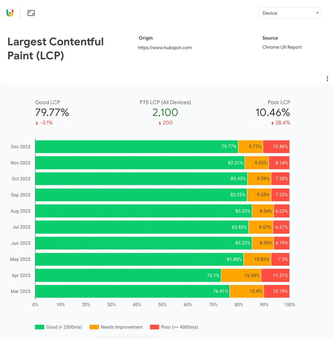
This view also gives us the value of P75, the 75th percentile of the metric. Under the LCP tab, this number means that 75% of users in the past 10 months experienced an LCP of less than 2,100 milliseconds.
Additionally, the default view for this tab displays data across devices. To filter by desktop or phone, use the dropdown menu in the top right corner.
After the three main Core Web Vitals, the CrUX Dashboard lets you view additional metrics. These include:
- Interaction to Next Paint (INP): Measures all instances of when a user interacts with a page and takes the longest duration between when a user initiates an interaction and a corresponding visual update.
- First Contentful Paint (FCP): The duration from when a page begins to load to when any part of the page from the DOM is visible.
- Time to First Byte (TTFB): The duration between a browser making an HTTP request to the hosting server and the first data of the web page received by the browser in response. Essentially, a measure of latency and server processing speed.
- First Paint (FP): The duration from when the page starts to load to when the first pixel is visible onscreen.
- DOM Content Loaded (DCL): The duration from when the page starts to load to when the DOM is fully loaded (not including stylesheets and images) and can be accessed by scripts.
- Onload (OL): The time taken for the page and all dependent resources to load.
- Notification Permissions: Whether users accept, dismiss, deny, or ignore notification permissions when prompted by the browser.
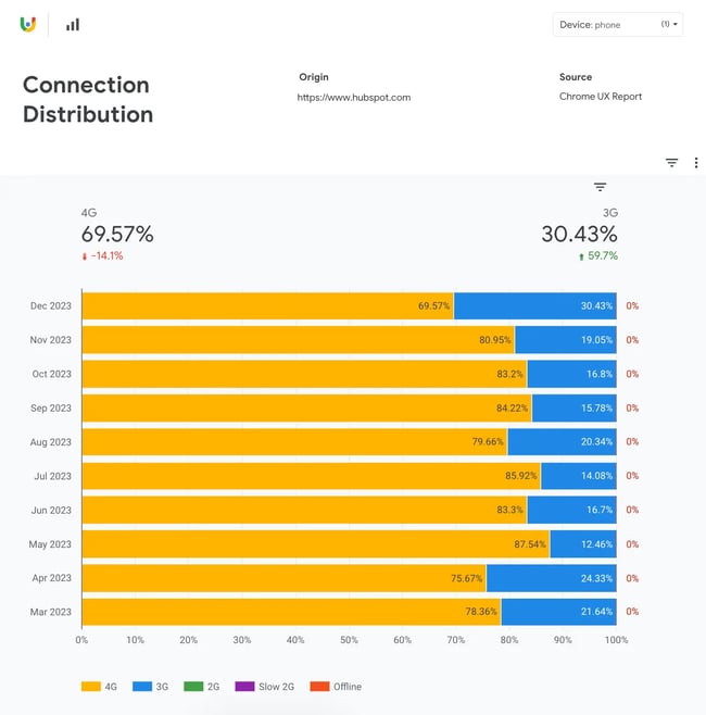
Finally, the CrUX Dashboard provides views that tell us how people are accessing the site. Device Distribution shows the share of devices (phone versus desktop) and Connection Distribution shows which connections are most popular. For hubspot.com, most mobile users are connecting with 4G or 3G.
Start querying CrUX today.
The great thing about the CrUX is that you have different viewing options. If the CrUX Dashboard is too in-depth and you just need to get an idea of your site’s performance at a glance, PageSpeed Insights will probably be able to help you more quickly.
Or, if you need a more detailed understanding of your website’s metric and/or want to build custom reports, consider using SQL queries or accessing its APIs. There is an option for anyone who wants to understand their website, regardless of technical expertise.
So, if you want to find out the truth about your site’s performance, there’s a dataset with your site’s name on it — ahem, in it.


![15 Best Wireframe Tools for Your Website Design [2024 Guide]](https://lh7-us.googleusercontent.com/3-6WlJtqrfXD8GteCr8Hrmr-WGvEExHxZ_7JNMiDatlbwpDplWMQ1hZl-iI-kni-9rRp_ygnABHlyoTiRNdJChRVmbUN6Gxt5vvfe6v_gzUKLFqPhUvU82ZO2CfMSncKW3CN9nfyBN7ZLukpMkcRmwo)